How to Add Texture to a Photograph
>> Wednesday, January 13, 2010 –
Photography
Oh boy, have I been having fun playing around with textures lately! Just the right texture can add volumes to a photo's vocabulary. Suddenly, a nice shot of a pretty flower has a whole new mood... era... nostalgia.
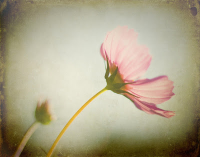
This is a perfect example. I love this shot. I took this picture just last fall. I love how the soft fall light is filtering through the delicate pink petals, and the gentle swoop of the stem. Beautiful.
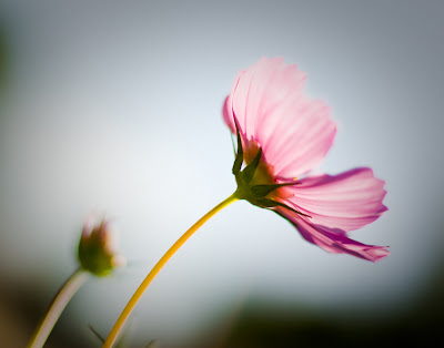
I also appreciate the simple beauty of this single blossom and the clean background. But....it seems to be lacking a little oomph to me. It just needs a little...something. I thought I'd give textures a try.
First things first, where to find great textures? Well, you can start by doing a search for "photoshop textures" I like to toss the word "free" in there too. Never hurts. You might be overwhelmed by your choices...and by the poor quality of some of what you'll find.
Let me save you some time and some hair-ripping-out sessions. Go visit my new best friend (who has absolutely no idea who I am, but hey, I'm not hurt)...Jerry Jones (aka SkeletalMess) at Shadow House Creations. BUT WAIT! Don't click over there quite yet. Once you click over to see all the beauty he has there, you won't be back here for a REALLY long time, and I want to show you how to use those incredible textures. I'll be quick so you can visit Jerry and download until your heart's content...or until your hard drive fills up...or until your computer starts smoking... whichever comes first :-)
When you find a texture (or 50) that you like, click on the link. It will bring you to Flickr, where this artist stores and displays his work. It also has a feature that enables you to download files. I typically click on the largest available size for download. Download the file, and drag it to wherever it is that you store your textures. I strongly recommend starting a file named "Textures" - that way you only have to go to one spot to open one up.
Okay. Now, open your original photo in PhotoShop.
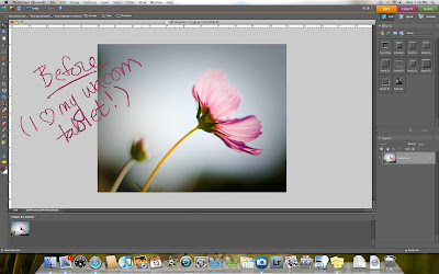
You also need to open the texture you want to try. Click "File-Open" up there in the upper left. Navigate to where you store your textures, and open the one you're going to use. Once it's open, click back over to your original photo. Your screen will look something like this:
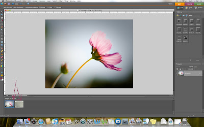
Now, click and drag the little picture of your texture and drop it on top of your photo. If you can't see your open files, you can click on a little arrow handle thingy...down there toward the bottom of your screen (I circled it).
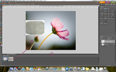
The next step is to re-size the texture so that it completely covers your photo (or the section of your photo that you want to add texture too). Do this by simply grabbing the various handles and dragging them to where you want them. CAUTION! I sometimes inadvertently overshoot the original photo's edges a bit. The result is that I miss some of the interesting edge detail found in many of the textures. Try to align the two photos as precisely as possible. I'll bet there's a trick to doing this...please leave me a comment if you know one!
You now have a texture layer totally covering your picture. The next step is to adjust the opacity of the texture layer. Reduce the opacity until it is to your liking. In my opinion, a texture should compliment the original photo, not distract from it. If someone looks at the end results and says "nice texture", I haven't done a good job. But hey, you're the artist! Do it how you like it.
Now we come to one of my favorite features of PhotoShop. It appears that I've modified my photo. BUT I DIDN'T. All I did was cover my original photo with a layer. If I don't like the changes caused by that layer, I can simply remove the layer and I'm left with my original photo. This is good...because I don't like this texture with this photo. It's just not doing it for me. So...I delete the layer and try again with a different texture.
Another cool trick with layers is to add several different textures at the SAME time. They each have their own layer. They work together really well sometimes. And sometimes, it's nice to be able to turn the layers on and off again (click the little eye icon on the layer). This will toggle the layer between visible and invisible. It's a nice way to decide which texture you like best.
Okay, so I tried this next layer. Now we're getting somewhere. I love the "bathed in sunlight from a summer long ago" look. Soft and pretty. I'd give it a solid "B". I think I'm looking for something different though. Let's try another.
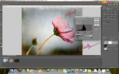
Alright, I found a texture that I like, but I'm not sure I like how washed out the flower seems. All the textures I tried had the same problem...they screamed "texture". I decided to play around with another trick...adding a new adjustment layer. Do this by clicking the circle that's half black and half white in the layers palette down in the lower right corner. I added a "levels" adjustment layer.
When I did this, a scary looking chart popped up. What to do when afraid? Go for it. Tweak and play and see what happens. Remember, you can always just delete the layer if you need to. In this case...I got just what I was looking for!
I grabbed the little triangle do-dads at the bottom of the chart, and I dragged them to the edges of the histogram. This balanced things out a bit, and really made the flower pop.
I tried this trick with a couple of different textures, and absolutely fell in love. This is now the new background on my computer's desktop...and there will soon be one hanging on the wall!
Here are my two favorite finished products. Which do you like best?


I like the texture in the darker version on top, but I like the green in the bottom one...you don't really get the green color right at the base of the flower in the top one. BTW, I'd love to order a print of this at some point. Will you be putting it on your website?